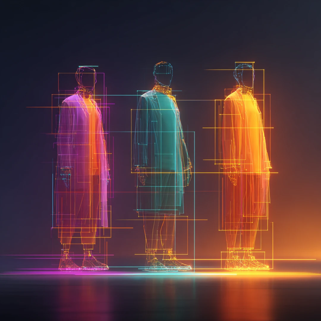
We ran an experiment this week. Claude shipped a new feature called Agent Teams — multiple AI instances that can coordinate, communicate, and work in parallel on a shared project. We wanted to see what it could actually produce on a real creative brief.
So we set up a competition. Six agents organized into three teams of two. Each team had a frontend developer and a dedicated UX/QA reviewer. The brief: build a new Neural Partners homepage. The primary constraint: it cannot look like AI made it. Best one wins.
Every team worked in an isolated directory with no shared dependencies. Each produced a single self-contained HTML file — no build step, no risk of teams stepping on each other's work.
What Makes Agent Teams Different
Agent Teams is still an experimental Claude Code feature, but the architecture is compelling. One session acts as the team lead, coordinating work and assigning tasks. Teammates work independently in their own context windows with full tool access — they can write code, run dev servers, and inspect each other's output.
The key detail: these agents can see their work. The QA reviewers opened the pages in a real browser, visually inspected layouts, checked responsiveness, filed feedback, and sent it back for iteration. This isn't code review by reading markup — it's visual QA with real screenshots.
Each team went through multiple revision cycles within the 40-minute window.
What Came Back
Three genuinely different creative directions. Not three variations on a theme — three distinct points of view on what Neural Partners should look and feel like.
Team 1 — Editorial Elegance. Clean, asymmetric hero layout with a floating "94% Agent Readiness" stat card. Scrolling marquee ticker. Numbered service cards. Light/dark section alternation for rhythm. Professional but played it safe — the editorial concept promised more personality than the execution delivered.
Team 2 — Bold Interactive. The strongest first impression. Mixed-weight typography with a floating node network (Schema, Data, Growth, Agents, Creative) orbiting a gradient sphere. Custom cursor follower. SVG blog illustrations. Industry marquee with orange dot separators. The most visually dynamic entry — the kind of site that turns heads in a portfolio.
Team 3 — Dark Mode Reimagined. A warm dark palette that avoids the cold, sterile AI aesthetic. Animated gradient orb with floating labels. But the real winner was the copy: "Ready to build something that actually works?" and "Let's skip the pitch deck and have a real conversation about your brand, your customers, and where AI fits in." The glassmorphism CTA card at the bottom was the single best design moment across all three entries.
The Scoring
The team lead opened all three in Chrome, scrolled through each top to bottom, and scored them across four dimensions:
| Criterion | Team 1: Editorial Elegance | Team 2: Bold Interactive | Team 3: Dark Mode Reimagined |
|---|---|---|---|
| Visual Design | 7.5 | 8.5 | 8.5 |
| UX Quality | 7.0 | 8.0 | 7.5 |
| Creativity | 7.0 | 8.5 | 8.0 |
| Human Feel | 7.0 | 7.5 | 8.5 |
| Total (/40) | 28.5 | 32.5 | 32.5 |
Teams 2 and 3 tied on total score, but Team 3 edged the win on the criterion that mattered most — human feel. When your primary constraint is "don't look AI-generated," the team with the most human copy voice and warmth wins. Team 2 was the flashier entry, but flash is something AI does well by default. Team 3's warmth and conversational tone are harder to produce by accident.
The honest recommendation: the best homepage is probably Team 3's soul layered onto Team 2's visual energy. That's our actual next step.
The feature is experimental. The implications aren't.
What We Learned
The brief matters more than the tool. The reason this experiment produced genuinely different creative directions is because the constraints were specific. "Don't look AI-generated" forced decisions that went beyond impressive CSS tricks and into actual design thinking — copy voice, color warmth, personality. A vague prompt would have produced three variations of the same generic SaaS template.
QA teammates changed the output quality significantly. Having a dedicated reviewer who could visually inspect the work in a real browser — not just read the code — created a feedback loop that meaningfully improved each variation through iteration. The QA agents caught spacing issues, animation timing problems, and contrast concerns that a code-only review would have missed.
The competition format works. Framing it as a competition rather than a single team doing three passes produced more creative divergence. Each team committed to a distinct direction rather than hedging toward a safe middle ground.
It's still early. Agent Teams is experimental. Session resumption doesn't work yet, which limits long-running jobs. Token costs multiply with each agent. The coordination overhead means this isn't the right tool for every task — it shines when parallel, independent work on a well-scoped brief adds real value.
The Numbers
- 6 agents working in parallel
- ~40 minutes total execution time
- ~800,000 tokens consumed
- 3 complete homepage variations with multiple QA iterations each
- Run on Claude Max subscription
Bottom Line
We're going to keep running these. Different briefs, different team structures, different project types. The pattern of parallel creative exploration with built-in QA is too useful to leave as a one-off experiment.
If you want to try it yourself: Claude Agent Teams documentation.
How Neural Partners Can Help
Our Emerging Technology Consulting team helps brands navigate tools like these — separating signal from noise and finding the workflows that actually move the needle.
Want to See What AI Can Build for You?
We're running experiments like this every week — testing new tools, new workflows, and new ways to move faster. Let's talk about what that looks like for your brand.
Start a Conversation